Interactive Dashboard
NDlib ships with a browser-based dashboard service that lets you build a graph, configure a model, and run a simulation from a single interface.
The dashboard is intended for quick experimentation, classroom use, and exploratory analysis when you want to compare multiple models without writing code.
Main features
Generate synthetic graphs or upload a custom network.
Inspect epidemic and opinion models through a three-step workflow.
Configure model parameters directly from the UI.
Select initial epidemic seeds by clicking nodes in the graph preview.
Use community-aware graph layouts to highlight structural groups.
Visualize trends, opinion evolution, prevalence, and network state.
Quick start
From the repository root, launch the service with:
python ndlib/dashboard/server.py
If the package is installed, the same service is also exposed as:
ndlib-dashboard
Then open the local URL printed by the server in your browser.
The standard workflow is:
Build or load a network.
Configure the model parameters.
Run the simulation and inspect the plots and graph view.
Example usage
Generate a small graph and simulate an epidemic model:
python ndlib/dashboard/server.py
or, if installed as a command:
ndlib-dashboard
In the dashboard:
Choose an epidemic model such as
SIR.Set the graph topology and the model parameters.
Click
Build / Load Network.Click
Run Simulation.Use the network tab to inspect the graph at each step.
For epidemic models, you can seed the outbreak by clicking nodes in the preview graph. If no nodes are selected, the dashboard uses the Initial infected share (%) field instead.
Screenshots
Configuration view:
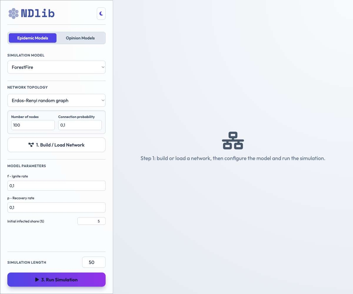
Dashboard configuration view with graph, model, and simulation controls.
Network view:
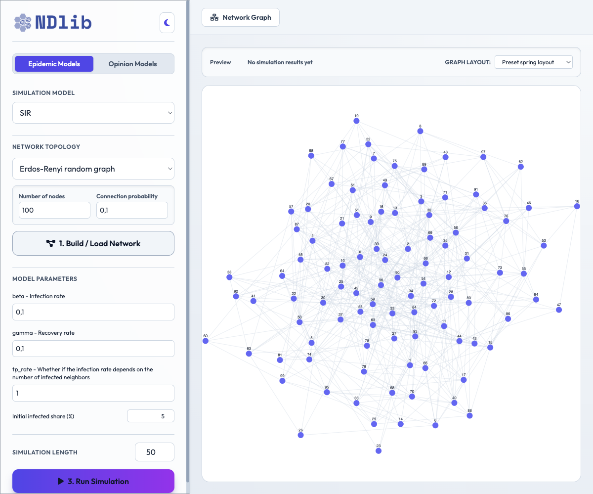
Dashboard network tab with the preview and layout controls.
Notes
The dashboard is a lightweight local service and is meant to complement, not replace, the Python API and the documented visualization modules.